
Formula 1 is and has been a favorite sport of mine since I was a kid. Extreme precision, high accuracy and excellent team are the key constituents for a team to participate and win the grand prix. The moment anyone decides to act on their own, the team can either lose position or straight away get out of the competition. All the major teams like Scuderia Ferrari, McLaren, Redbull, Renault and numerous others compete for the world championship. As data science enthusiasts and huge fans of Formula1, I along with Vineet Viswakumar decided to analyze the Formula1 dataset that we took from Kaggle which provided us with the open dataset that provided us with numerous data attributes like Formula1 drivers, races, lap timings, seasons data, pitstop status and other related attributes.

TL;DR we decided to analyze this dataset with various visualization tools like Tableau, plotly, matplotlib, seaborn and various others. Turns out, the dashboard look really promising and open the potential to analyze this huge platform which is open for the data science world to analyze the history and the results and apply modern techniques and methodologies like machine learning, reinforcement learning, ARIMA modelling and numerous others.
This is the preliminary analysis in the form of Tableau interactive dashboards to present this huge dataset:
Gantt Chart
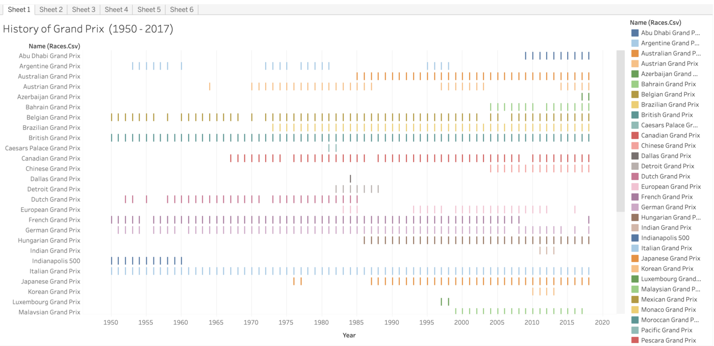
Gantt chart depicts history of Grand Prix in the period (1950–2017). This chart nicely describes the occurrences of grand prix in the period 1950 to 2017.
Discrete Line Chart:
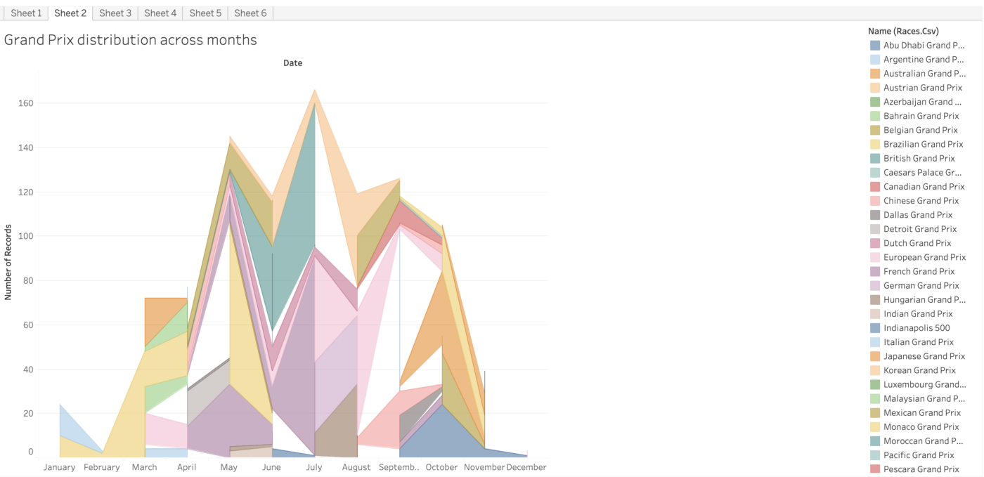
Line chart depicts Grand prix distribution across the year from January to December for all the grand prix.
Symbol Map:
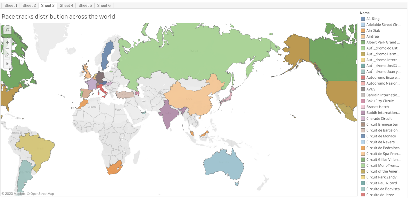
Symbol map depicts the distribution of race tracks across the world. This show the spread of this glamours event across the world where the highlighted colors indicate the circuit locations.
Circle View:

Circle chart describes the nationalities of F1 drivers with various colors. Along with being the most competitive sport, this sport is equally enjoyed by a diverse group of people. These are the various nationalities of the drivers participating in the grand prix.
Bubble chart:

Bubble chart depicts the number of rounds across the participating drivers in F1 where the size of the bubbles are proportionate to the the number of rounds played by respective drivers in the corresponding Grand prix.
Stacked Bar Chart:
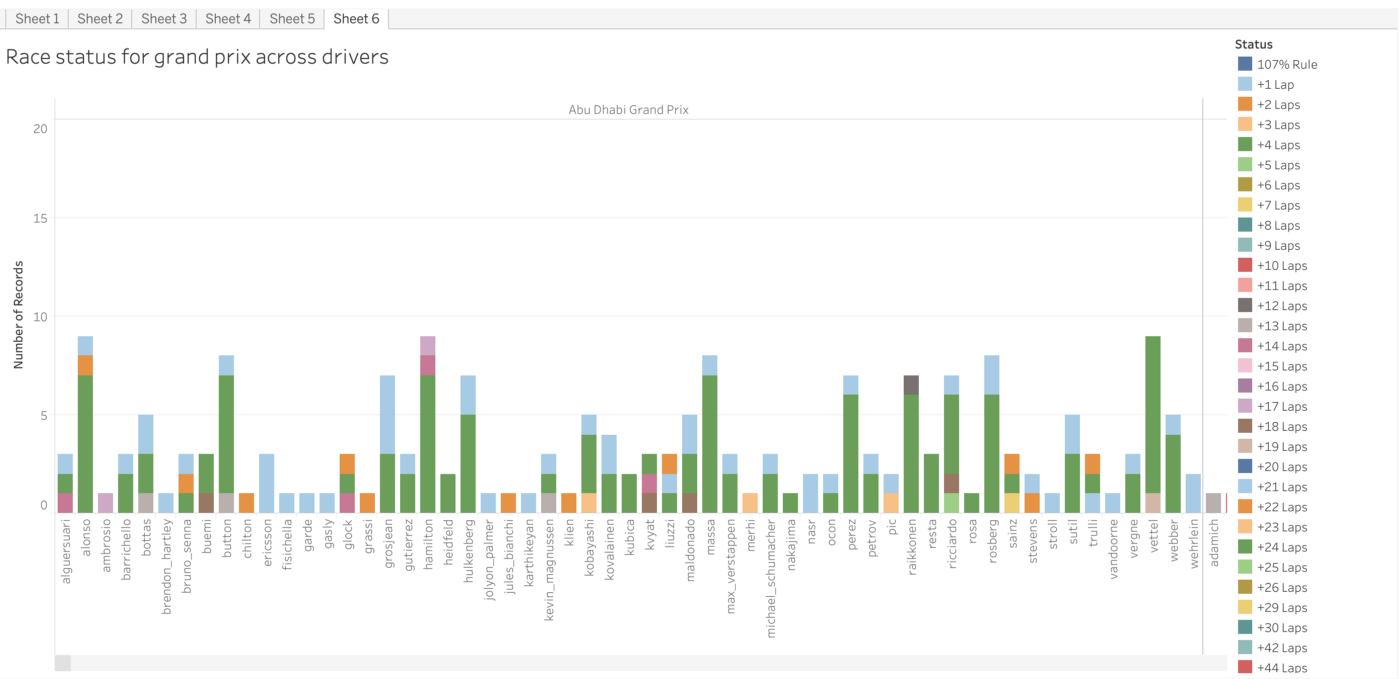
Stacked Bar chart describing the race status for grand prix for the participating drivers in F1. This includes various status for respective drivers who participated in the various grand prix organized over the world.
Check out the complete code for the analysis of GitHub:
https://github.com/gandalf1819/Formula1
Check out the interactive Tableau dashboards here:
https://public.tableau.com/profile/chinmaynw#!/vizhome/Formula1Analysis/Sheet1
We will be adding further analysis and more intuitive plot showing trends across this period to enrich the results and gain meaningful insights using various tools and methodologies in the data science community! Any suggestions or improvements in improving the analysis are welcomed and we would love to hear your ideas over this subject. While this still remains a sport followed by a selected enthusiasts who love the sport dynamics and the energy, we would recommend everyone to give it a shot!
“As Formula1’s tagline goes: ‘Engineered Insanity!’ — it’s time that we follow the same mindset from the technological perspective!”

References:
[1] https://www.kaggle.com/cjgdev/formula-1-race-data-19502017


Comments